install.packages("ggplot2")
install.packages("readxl")
install.packages("Rmisc")
install.packages("reshape")R Intro
This is a short introduction to R and statistics written to accompany introductory biology courses. This document will prepare you to perform statistic analysis and visualize results using R for most biology labs.
Why use R? See here.
1. Using R in RStudio locally or online
1.1 Installation or sign up
R is a command line program where you interact with it through text (command line) instead of a graphical user interface (e.g., Windows, Excel, etc.). There are two options for running R in this class.
In both options, you will not interact directly with R, but through an integrated development environment called Rstudio on your computer or online (the cloud version of Rstudio is called Posit since 2022).
1.2 Project setup and file transfer
1. Local option
If you choose the local option, you should set up a project and a folder that is associated with this project where all files will be stored.
For example, create a folder on your desktop that is called “R_is_fun”. Start RStudio, click File > New Project… and select “Existing Directory” and browse to the folder “R_is_fun”.
Then click “Create Project”. Now you can access all files in the folder “R_is_fun” (without indicating the full pathname) and everything you saved in R will also appear in this folder.
2. Online option
If you choose the cloud option, you will need to upload/download files to/from the cloud.
On posit.cloud, click “New Project” > New RStudio Project on the upper right. Once the project is deployed, on the lower right panel, click the “upload” button and choose the file from your computer.
To download a file, check the box next to the file, click the “More” > Export… and click “Download”.
1.3 The RStudio Interface
Let’s introduce what is being displayed in RStudio. Before we get started, click File > New File > R Script. This will result in a default four-panel interface Figure 1.
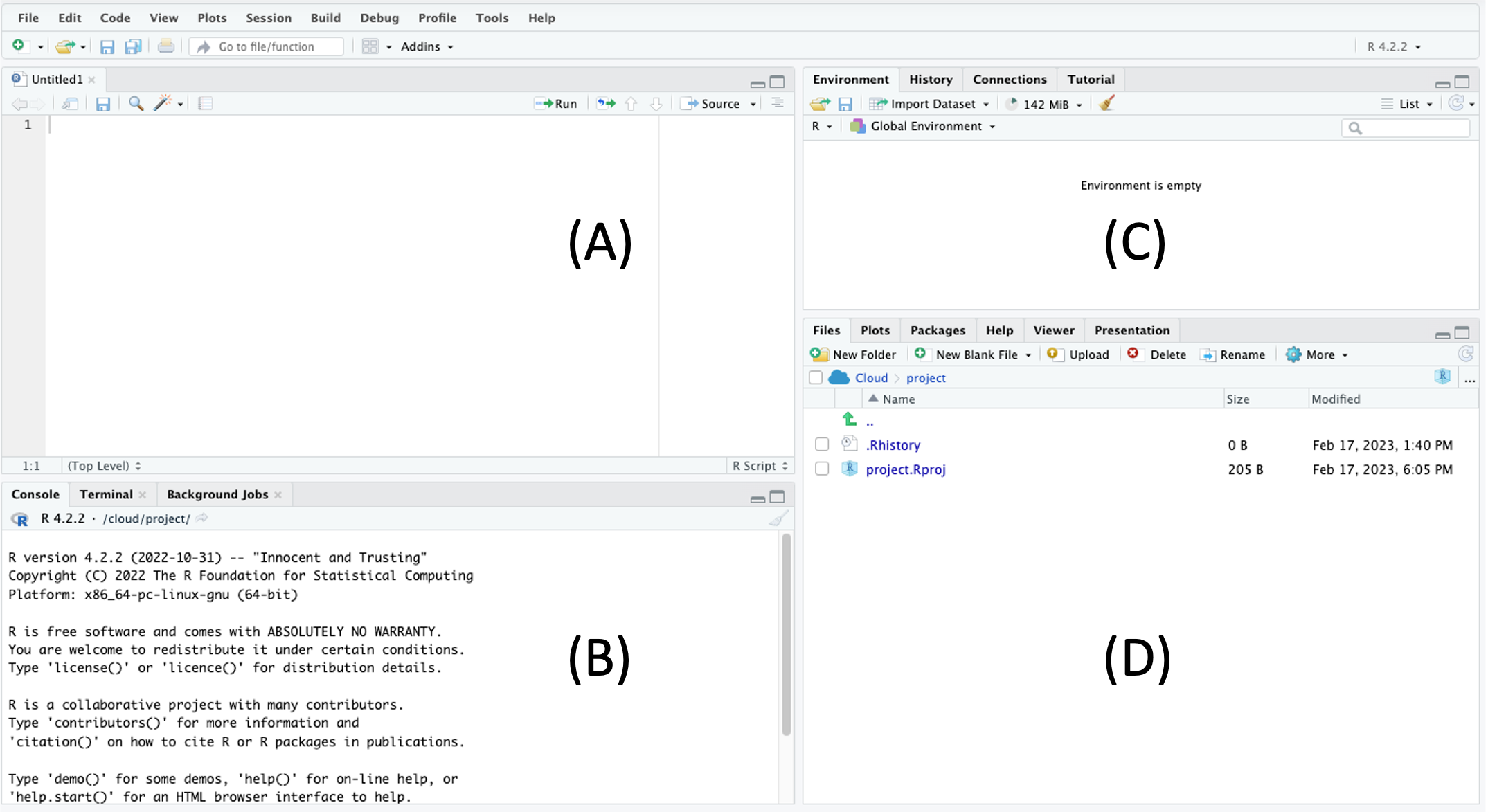
(A) The upper left is the R script panel. This is where you will write and save your R script or commands. The panel should be saved regularly, which serves as a record of all the commands that you have (or are planning) to run. For example, clicking File > Save and giving it the name “R_is_fun” will save it as “R_is_fun.R” in your working directory. The scripts here are not being read by R until you click the “Run” button on the top right.
(B) The lower left is the R console, which is the innate command line interface of R. A command from the R script above will be displayed here when you click the “Run” button, which is when R “reads” your command. Any output or error from R will also be displayed here. You could type your command directly here, but it will not be saved in the R script.
(C) The upper right is the environment panel. Objects that are read or generated in R will be displayed here, along with any packages that you load and functions that you create.
(D) The lower right is the files panel. It displays the files in your working directory. It also displays figures in a “Plots” tab if your commands result in graphical outputs. The Help tab displays the manual for each package and command.
For a more comprehensive introduction to RStudio, see here.
1.4 Using packages
Many packages are available to expand the basic functions of R.
To use these packages, you will need to install them first. Then you can load the package as libraries.
We will install a few packages that will be used in this document. You may be asked to select a mirror to download the packages. Note that you will only need to do this once for each Project.
Then, we will load this packages such that functions from these packages can be used. Note that you will need to run this each time when you start your Project.
library("ggplot2")
library("readxl")
library("Rmisc")
library("reshape")
2. Importing data into R
2.1 Preparing a .csv file from Excel
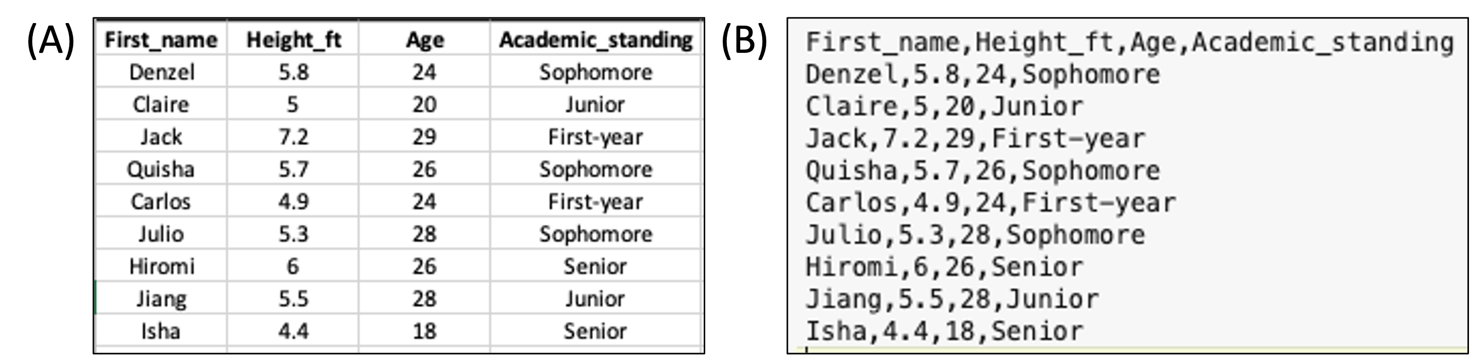
Your data should be entered and stored in spreadsheet programs such as Microsoft Excel before being imported into R. While R can read Excel files such as .xls and .xlsx, data are typically saved into a simpler text format such as .csv (comma-separated values), where each row appears in a new line and each column is separated by a comma (,) (Figure 2).
A spreadsheet in Excel can be exported into .csv by clicking File > Save As… and selecting CSV in the drop-down manual under File Format.
Try doing this with name.xlsx which can be downloaded from here.
Place the .csv file into your project’s directory (e.g., R_is_fun) or upload it to your project in posit.cloud (see 1.2 Project setup and file transfer).
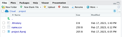
Now, you should see the .csv file listed in the lower right panel of RStudio (?@fig-file_panel).
 .
.
2.2 Loading a .csv file into R
Note that while the name.csv file is in the file panel, it’s not being loaded into R yet. To do that, in the R script panel, type:
data_name = read.csv(file = "name.csv")
# or just
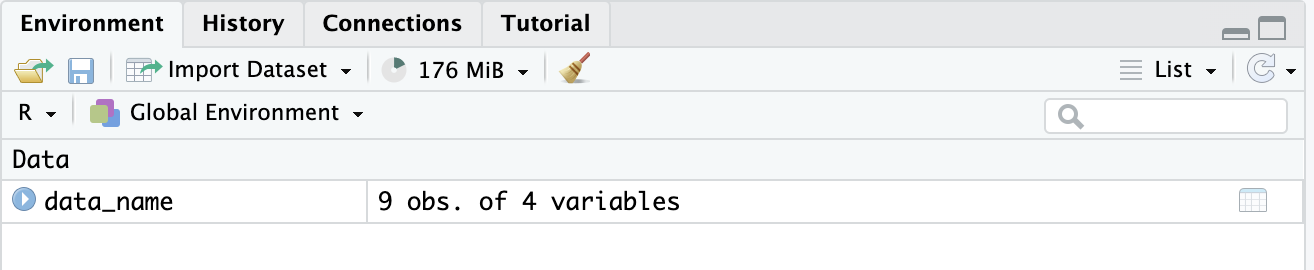
# data_name = read.csv("name.csv")What the code does is load “name.csv” into R and save it as an object called “data_name”. Now the object “data_name” should appear in the environment panel (Figure 3).
In the environmental panel, you can click on the object to open it in a new tab in the R script panel. Note that doing it actually sends a script to the R console as: View(data_name)
You can also view the object within the R console by calling it directly:
data_name First_name Height_ft Age Academic_standing
1 Denzel 5.8 24 Sophomore
2 Claire 5.0 20 Junior
3 Jack 7.2 29 First-year
4 Quisha 5.7 26 Sophomore
5 Carlos 4.9 24 First-year
6 Julio 5.3 28 Sophomore
7 Hiromi 6.0 26 Senior
8 Jiang 5.5 28 Junior
9 Isha 4.4 18 SeniorYou can see that the file has loaded correctly. The 9 rows and 4 columns are present, as well as the column titles.
The object is a dataframe, which is a class of R object that stores table. See here for other classes in R.
class(data_name)[1] "data.frame"You can get more information of a dataframe with:
str(data_name)'data.frame': 9 obs. of 4 variables:
$ First_name : chr "Denzel" "Claire" "Jack" "Quisha" ...
$ Height_ft : num 5.8 5 7.2 5.7 4.9 5.3 6 5.5 4.4
$ Age : int 24 20 29 26 24 28 26 28 18
$ Academic_standing: chr "Sophomore" "Junior" "First-year" "Sophomore" ...In some cases, you may need to add more arguments to read.csv(). Explore the documentation of this function.
help("read.csv")You can also search for it in the Help tab in the file panel. Another useful tips is that after you type help(, you can hit the tab key and RStudio will show the possible arguments for. Note also that RStudio will auto-complete the closing bracket for you.
2.3 Loading an Excel file directly
You can also directly import an Excel file into R with the help of the readxl package.
If you saved your Excel file as name.xlsx, then the command below will read the first sheet of an Excel file by default.
read_xlsx(path = "name.xlsx")# A tibble: 9 × 4
First_name Height_ft Age Academic_standing
<chr> <dbl> <dbl> <chr>
1 Denzel 5.8 24 Sophomore
2 Claire 5 20 Junior
3 Jack 7.2 29 First-year
4 Quisha 5.7 26 Sophomore
5 Carlos 4.9 24 First-year
6 Julio 5.3 28 Sophomore
7 Hiromi 6 26 Senior
8 Jiang 5.5 28 Junior
9 Isha 4.4 18 Senior Note that the above code does not save or overwrite the object data_name because we did not do the data_name = read_xlsx(path = "name.xlsx"). It simply read and output the result into the R console.
3. Data Visualization
Before you analyze the data, you should take a graphical look at your data. Here’re two common ways.
3.1 Bar Graph
A bar graph is used to visualize a continuous variable against a categorical variable.
While R can generate plots using the build-in functions, we will use the package ggplot2 since it provides more ways to customize your plots.
Using data_name we can plot Age against Academic_standing. If you do not remember what are the names of your object, you can use names(data_name)
ggplot(data = data_name, aes(x = Academic_standing, y = Age)) +
  geom_col()
The code can be simplified using the idea of positional arguments:
ggplot(data_name, aes(Academic_standing, Age)) + geom_col()
Now you may want to (1) arrange your x-axis in a specific way, (2) get rid of the underscore in the x-axis, and (3) use different colors for each bar. You can do this by:
# Setting Academic_standing as a factor with a specific order of levels.
# Note that this code modified data_name.
# There may be some cases where you don't want this change to be permanent,
# so you can then create a different object.
# For example `data_name_sorted = data_name`

data_name$Academic_standing = factor(data_name$Academic_standing, level = c("First-year", "Sophomore", "Junior", "Senior"))


# The main ggplot command is the same, but we have added:
# labs(x = ..., y = ...) to specify  axis titles
# fill = Academic_standing within aes to assign fill according to Academic_standing using the default color palette.
# Note that if you do color = , it will change the color of the boundary of the bar instead.

ggplot(data = data_name, aes(x = Academic_standing, y = Age, fill = Academic_standing)) +
  geom_col() +
  labs(x="Academic standing")
Note that in your R script, you can use # to add comments and notes. These will not be read by R.
3.2 Scatter Plot with a Linear Fit
A scatter plot is used to visualize a the relationship between two continuous variables.
Continuing to use data_name, we can first plot a scatter plot between Height_ft and Age.
ggplot(data = data_name, aes(x = Age, y = Height_ft)) +
  geom_point() +
  ylab("Height (feet)") # another way to change axis label
To add a linear fit line, you can use geom_smooth(method = lm).
ggplot(data = data_name, aes(x = Age, y = Height_ft)) +
  geom_point() +
  geom_smooth(method = lm) +
  ylab("Height (feet)")
`geom_smooth()` using formula = 'y ~ x'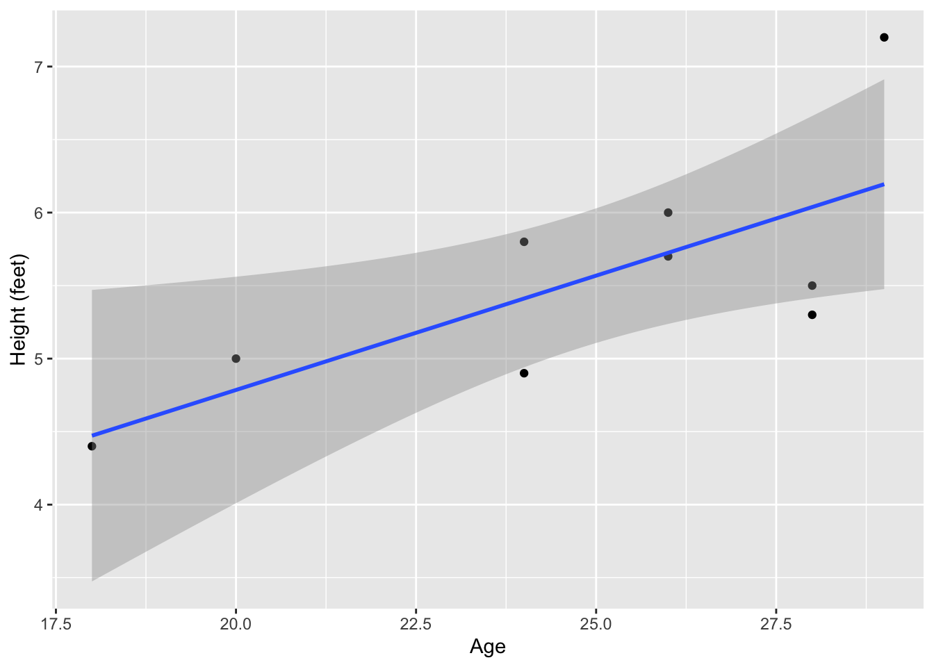
The figure above shows the linear fit line in blue and the standard error (SE) in grey. You can remove the SE and change the line to a grey, dashed line (e.g., to indicate a non-significant fit line). We will more properly evaluate the significance of the fit line later under the section 5. Inferential statistics.
ggplot(data = data_name, aes(x = Age, y = Height_ft)) +
  geom_point() +
  geom_smooth(method = lm, se = F, color="grey", linetype="dashed") +
  ylab("Height (feet)")
`geom_smooth()` using formula = 'y ~ x'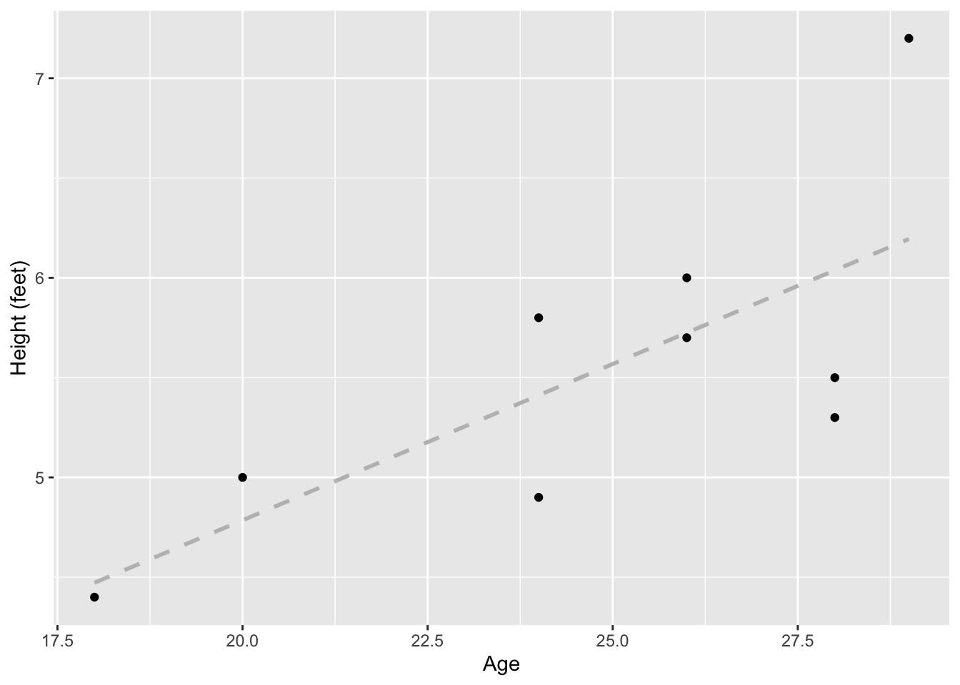
4. Descriptive statistics
When you first get your data, it will be wise to look at some numeric summaries of your dataframe.
summary will give a summary of each column, depending on whether the column is numeric or categorical.
summary(data_name) First_name Height_ft Age Academic_standing
Length:9 Min. :4.400 Min. :18.00 First-year:2
Class :character 1st Qu.:5.000 1st Qu.:24.00 Sophomore :3
Mode :character Median :5.500 Median :26.00 Junior :2
Mean :5.533 Mean :24.78 Senior :2
3rd Qu.:5.800 3rd Qu.:28.00
Max. :7.200 Max. :29.00 You can get the summary or specific summary statistics of a specific column using $:
summary(data_name$Height_ft) Min. 1st Qu. Median Mean 3rd Qu. Max.
4.400 5.000 5.500 5.533 5.800 7.200 summary(data_name$Academic_standing)First-year Sophomore Junior Senior
2 3 2 2 4.1 Min, Max, Median & Mean
You can also these functions:
min(data_name$Age)
max(data_name$Age)
median(data_name$Age)
mean(data_name$Age)
[1] 18
[1] 29
[1] 26
[1] 24.777784.2 Quantiles
For quantiles:
quantile(data_name$Age) 0% 25% 50% 75% 100%
18 24 26 28 29 Specific quantile:
quantile(data_name$Age, probs = 0.95) 95%
28.6 4.3 Standard Deviation and Standard Error
Standard deviation and standard error of the mean using base R:
Standard deviation:
sd(data_name$Age)[1] 3.734226Standard error by calculating it from sd():
sd(data_name$Age)/sqrt(length(data_name))[1] 1.867113Standard error using the summarySE function in Rmisc
summarySE(data = data_name, measurevar = "Age") .id N Age sd se ci
1 <NA> 9 24.77778 3.734226 1.244742 2.87038To output just the se from summarySE():
summarySE(data = data_name, measurevar = "Age")$se[1] 1.244742To summarize within group (e.g., Academic_standing), we can also use the function in Rmisc
summarySE(data = data_name, measurevar = "Age", groupvars = "Academic_standing") Academic_standing N Age sd se ci
1 First-year 2 26.5 3.535534 2.500000 31.765512
2 Sophomore 3 26.0 2.000000 1.154701 4.968275
3 Junior 2 24.0 5.656854 4.000000 50.824819
4 Senior 2 22.0 5.656854 4.000000 50.8248195. Inferential statistics
See this link for which statistical test to choose from based on the type of data. The link has example R codes as well! Below are a few commonly used ones.
5.1 Linear regression
Linear regression tests the relationship between two continuous variables. The analysis can estimate the a regression line that best fit the data using the least squares method (see here). It also estimates the slope and intercept of the linear regression line and allows testing whether they are significantly different from zero.
In R the lm function can fit a number of linear models, including linear regression.
The code below creates a linear model (lm_HA) to predict Height_ft (the response or dependent variable) by Age (the predictor or independent variable):
lm_HA = lm(formula = Height_ft ~ Age, data = data_name)
lm_HA
Call:
lm(formula = Height_ft ~ Age, data = data_name)

Coefficients:
(Intercept)          Age
     1.6538       0.1566
Calling lm_HA shows the coefficients for intercept and slope (under “Age”). But we can get much more out of lm_HA using summary().
summary(lm_HA)
Call:
lm(formula = Height_ft ~ Age, data = data_name)

Residuals:
    Min      1Q  Median      3Q     Max
-0.7379 -0.5115 -0.0247  0.2753  1.0056

Coefficients:
            Estimate Std. Error t value Pr(>|t|)
(Intercept)  1.65378    1.38315   1.196   0.2708
Age          0.15657    0.05527   2.833   0.0253 *
---
Signif. codes:  0 '***' 0.001 '**' 0.01 '*' 0.05 '.' 0.1 ' ' 1

Residual standard error: 0.5837 on 7 degrees of freedom
Multiple R-squared:  0.5341,    Adjusted R-squared:  0.4676
F-statistic: 8.026 on 1 and 7 DF,  p-value: 0.0253
Under “Coefficients”, it shows a t-test of whether the intercept and slope (Age) is significantly different from zero.
In the last three lines, it shows:
Residual standard error: lower values suggest better fit (i.e., less distance between the data point and the predicted line).
Degrees of freedom: the maximum number of logically independent values.
Multiple R-squared: the percentage of the response variable variation that a the model explains.
Adjusted R-squared: R-squared adjusted for the number of terms in the model. Use this to compare between models with different number of predictor variables.
Statistics of a F-test that evaluates the fit of the model.
Although the F-test is at the end, it should be examined first to determine whether the linear model fits the data. Only when the model is well fitted, should you further interpret the significance of the intercept and slope.
In this example, the linear regression is significant because the p-value of the F test is lower than 0.05 (p = 0.0253), so we can continue to examine the intercept and slope.
The slope is 0.15657 (under “Estimate” in “Coefficient”) and the t-test indicates that it is significantly different from zero (p = 0.0253). Note that this p-value is the same as that of the F-test only when there is one predictor variable. In multiple regression, there will be separate t-tests for each predictor variable.
Therefore we can write a statement to summarize the result and provide the statistical support:
There is a positive relationship between height and age (slope = 0.157, F = 8.026, d.f. = 1 and 7, p = 0.025).
Visualization
Visualization for linear regression is shown above in 3.2 Scatter Plot with a Linear Fit.
5.2 T-test
A two sample t-test compares the means of two samples. The predictor (independent) variable is nominal and has two categories (i.e., binomial). The response (dependent) variable is continuous. In other words, a two sample t-test tests whether the binomial predictor affects the continuous response variable.
We will create a new variable called Age_group: A when Age <= 25 and B when Age > 25.
data_name$Age_group <- with(data_name, ifelse(Age <= 25, "A", "B"))You can View(data_name) to check that we now have a new column in data_name.
To test whether Height_ft is different between Age_group A and B, in other word, whether Age_group affect Height_ft, we can use t.test():
t.test(Height_ft~Age_group, data = data_name, alternative = "two.sided", var.equal = FALSE)
    Welch Two Sample t-test

data:  Height_ft by Age_group
t = -2.0638, df = 6.9999, p-value = 0.07792
alternative hypothesis: true difference in means between group A and group B is not equal to 0
95 percent confidence interval:
 -1.9633556  0.1333556
sample estimates:
mean in group A mean in group B
          5.025           5.940
alternative can also be “greater” or “less” if you have an a priori reason to test a directional difference between groups.
In this case, the p-value is 0.07792. We failed to reject the null hypothesis that Age_group can affect Height_ft. Hence we can write a summary statement like:
Age group does not significantly affect height (t = -2.064, d.f. = 7.000, p = 0.078)
Visualization
You can plot the continuous variable from two groups in a number of ways.
One way is to use a boxplot:
ggplot(data = data_name, aes(x = Age_group, y = Height_ft)) +
  geom_boxplot() +
  labs(x = "Age group", y = "Height (feet)")
You can even overlap your datapoints on top of the boxplot using geom_point() or geom_jitter():
ggplot(data = data_name, aes(x = Age_group, y = Height_ft)) +
  geom_boxplot() +
  geom_jitter(width = 0.1, height = 0) + # this allows overlapping points to be seen
  labs(x = "Age group", y = "Height (feet)")
5.3 ANOVA
Analysis of variance (ANOVA) is used similar to the t-test, but when the predictor variable has three or more categories.
To test whether Academic_standing affects Age, we will build the model using aov(), then use summary() to show the full results:
anova_model = aov(formula = Age ~ Academic_standing, data = data_name)
summary(anova_model)
Df Sum Sq Mean Sq F value Pr(>F)
Academic_standing 3 27.06 9.019 0.534 0.679
Residuals 5 84.50 16.900 Note that the results is similar to the F-test in the last part of regression, because ANOVA and regression are both linear models. But in ANOVA, we don’t have predictions of slope and intercepts.
In this case, since the p-value is >0.05. We failed to reject the null hypothesis that Academic_standing has an effect on Age. Therefore, we can write a summary statement to say:
Academic_standing does not significantly affect Age (F = 0.534, d.f. = 3 and 5, p - 0.679)
Visualization
Similar to the t-test, we can plot the data used for ANOVA using a boxplot:
ggplot(data = data_name, aes(x = Academic_standing, y = Age)) +
  geom_boxplot() +
  geom_jitter(width = 0.1, height = 0) + # this allows overlapping points to be seen
  labs(x = "Academic standing", y = "Age")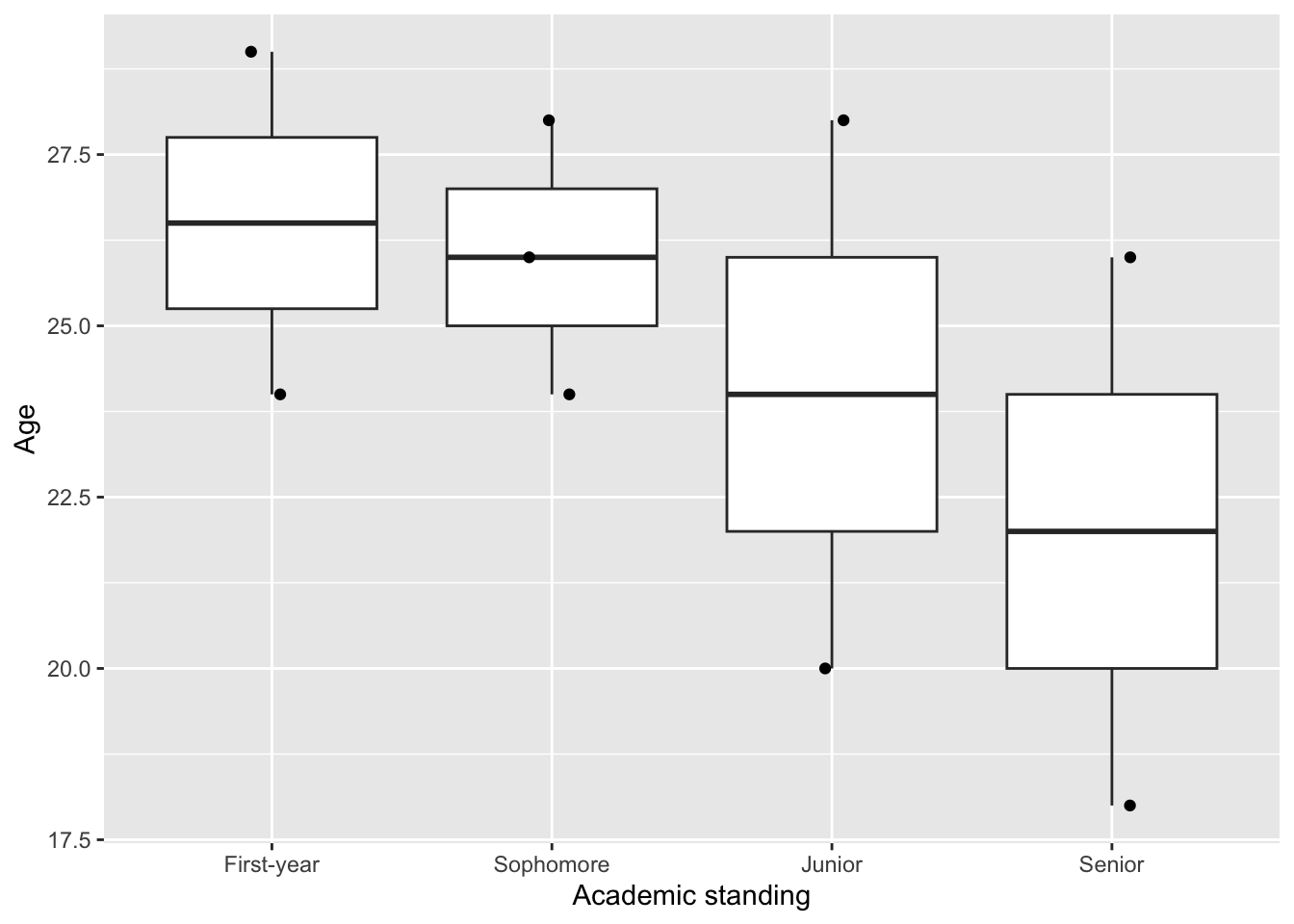
Note that showing the data points gives a more complete representation of our data. If you see only the boxplot, you could imagine having a lot of data. But in fact, there are only 2-3 data point for each predictor variable. Some of them are even laying quite far apart from each other.
5.4 Chi-square - Goodness of Fit test
There are two types of Chi-Square tests, which are used for categorical response (e.g., eye color, location, etc.)
The goodness of fit Chi-square test is used to test whether the distribution of a categorical variable is significantly different than an “expected” distribution. There is no predictor in this case.
For example, in a population of fish, we may count the number of female and male individuals. We may expect the sex ratio to be 1:1 and we can test it with the chi-square goodness of fit test.
For example, let’s first generate a count of Age_group:
obs_age_group = table(data_name[,"Age_group"])
obs_age_group
A B
4 5
We can then test whether the observed distribution of Age_group is equally distributed among the two groups (i.e., 1:1) using chisq.test().
chisq.test(x = obs_age_group)Warning in chisq.test(x = obs_age_group): Chi-squared approximation may be
incorrect
    Chi-squared test for given probabilities

data:  obs_age_group
X-squared = 0.11111, df = 1, p-value = 0.7389
The null hypothesis of the test is that the groups are equally distributed. The p-value is > 0.05, which means that we have failed to reject the null hypothesis. Therefore, our observed distribution of Age_group is not significantly different from 1:1.
If there is an a priori reason that the distribution should be, for example, 3:1, we can modify the code to test this:
chisq.test(x = obs_age_group, p = c(3/4,1/4))Warning in chisq.test(x = obs_age_group, p = c(3/4, 1/4)): Chi-squared
approximation may be incorrect
    Chi-squared test for given probabilities

data:  obs_age_group
X-squared = 4.4815, df = 1, p-value = 0.03426
In this second test, the p-value is < 0.05, so we can reject the null hypothesis. Hence the distribution is significantly different from 3:1.
Visualization
You can plot the data for a goodness of fit Chi-square test by using the raw data in data_name.
ggplot(data = data_name, aes(x = Age_group)) +
  geom_bar() +
  labs(x = "Age group", y = "Count")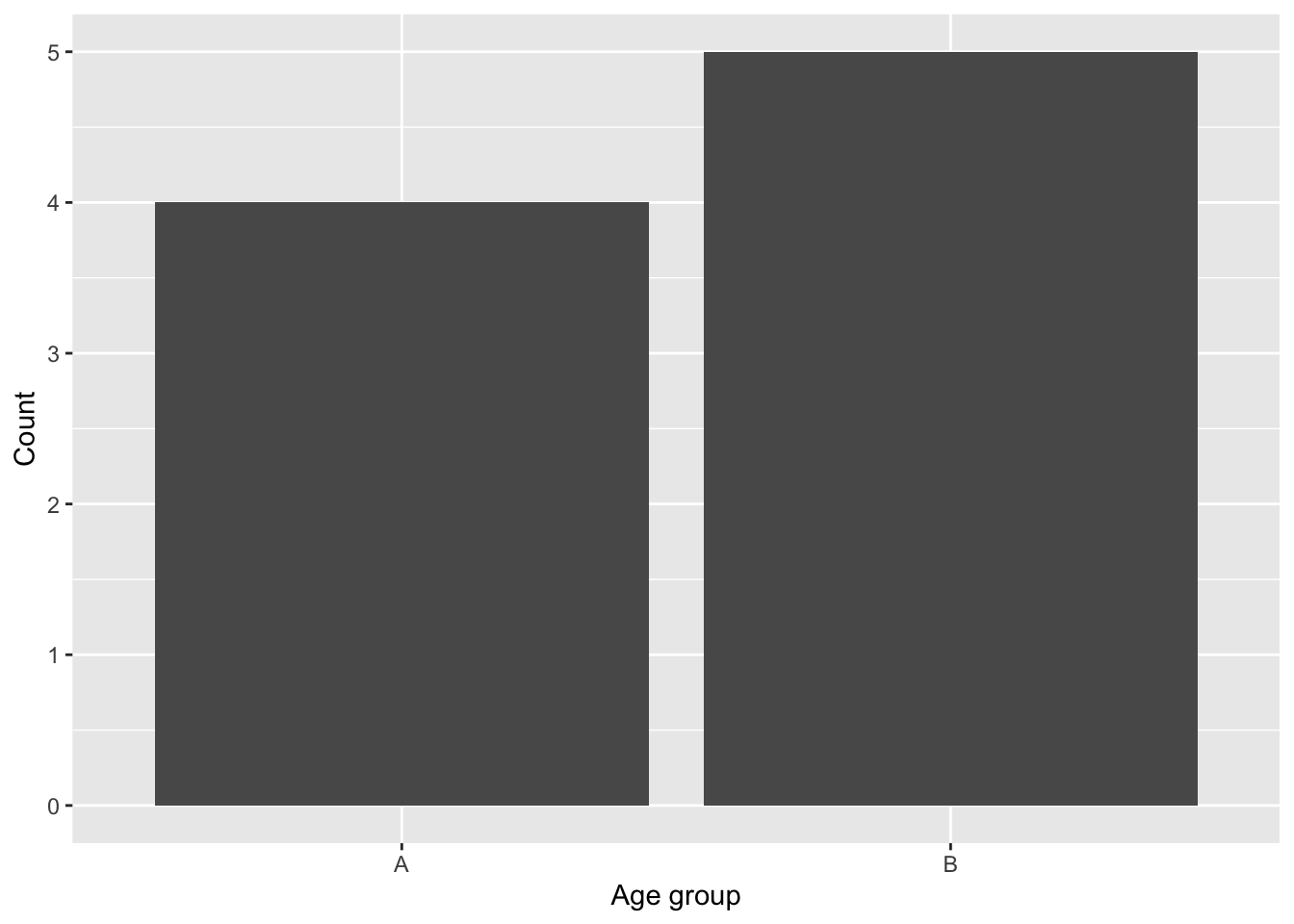
Alternative, you could also plot is using the count data obs_age_groupafter converting it to a dataframe:
ggplot(data.frame(obs_age_group), aes(Var1, Freq)) +
  geom_col() +
  labs(x = "Age group", y = "Count")
5.5 Chi-square - Contingency test
The Contingency test (or the test of Independence) examine if the distribution of a categorical variable (e.g., Age_group) is significantly different depending on (contingent on) another categorical variable (e.g., Academic_standing). Or, put another way, you might want to determine if the frequency of outcomes for one set of observations matches those for another set of observations.
Using the sex ratio example above, we could sample the number of female and male in two populations of fish, one with high predation pressure and one with low predation pressure. You may want to compare whether predation pressure affect the sex ratio. In this case, the predictor variable, predation pressure, is categorical. The response variable, sex, is also categorical. The analysis to use is the chi-square contingency test.
Going back to our example student data in data_name. We will first reshape our data into a contingency table using table():
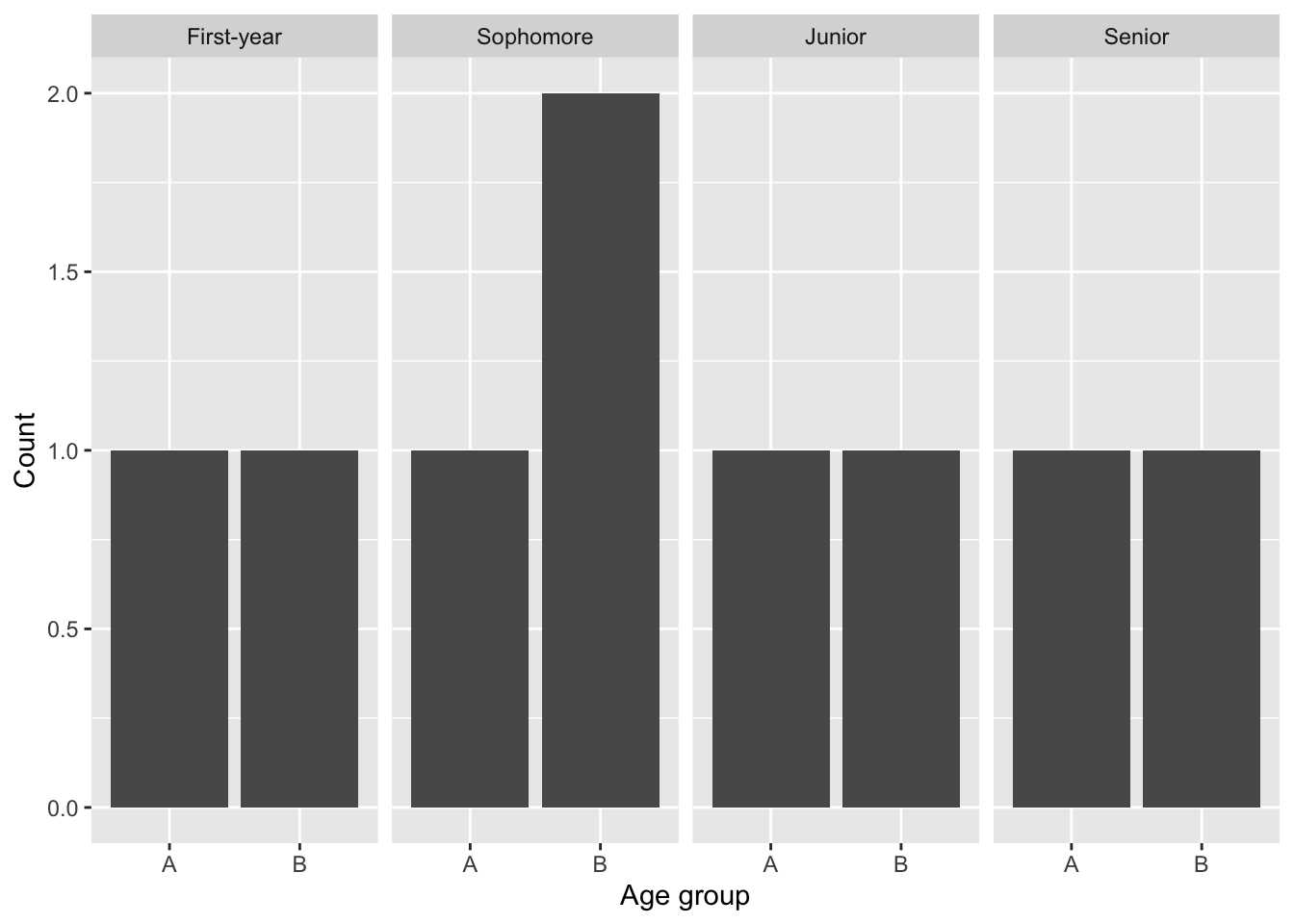
obs_table = table(data_name$Age_group, data_name$Academic_standing)
obs_table
    First-year Sophomore Junior Senior
  A          1         1      1      1
  B          1         2      1      1
The table above shows that, like in 5.4 Chi-square - Goodness of Fit test we have the number of counts in Age_group A and B, but now from each category of Academic_standing.
We can then test the null hypothesis that the two variables Age_group and Academic_standing are independent.
chisq.test(obs_table)Warning in chisq.test(obs_table): Chi-squared approximation may be incorrect
    Pearson's Chi-squared test

data:  obs_table
X-squared = 0.225, df = 3, p-value = 0.9735
The p-value is > 0.05. So we have failed to reject the null hypothesis. Hence the two variable are independent. In other words, Academic_standing does not affect the distribution of Age_group.
Visualization
You can plot the contingency table by geom_bar():
ggplot(data = data_name, aes(x = Age_group)) + geom_bar() + facet_grid(~Academic_standing) +
  labs(x = "Age group", y = "Count")